swarmchart
Description
swarmchart( creates a swarm chart,
or scatter plot with jittered (offset) points, for each predictor in
explainer)explainer.BlackboxModel.PredictorNames, where
explainer is a shapley object. For
each predictor, the function displays the Shapley values for the query points in
explainer.QueryPoints. The corresponding swarm chart shows the
distribution of the Shapley values.
If explainer.BlackboxModel is a classification model, the function
displays swarm charts for class explainer.BlackboxModel.ClassNames(1) by
default.
swarmchart(
specifies additional options using one or more name-value arguments. For example, specify
explainer,Name=Value)NumImportantPredictors=5 to create swarm charts for the five predictors
with the greatest mean absolute Shapley values
(explainer.MeanAbsoluteShapley).
swarmchart( displays the
swarm charts in the target axes ax,___)ax. Specify ax as
the first argument in any of the previous syntaxes.
s = swarmchart(___)Scatter objects. Use s to query or modify the
properties (Scatter Properties) of an object after you
create it.
Examples
Shapley Value Swarm Charts for Classification Model
Train a classification model and create a shapley object. Then visualize the Shapley values for multiple query points by using the swarmchart object function.
Load the CreditRating_Historical data set. The data set contains customer IDs and their financial ratios, industry labels, and credit ratings.
tbl = readtable("CreditRating_Historical.dat");Display the first three rows of the table.
head(tbl,3)
     ID      WC_TA    RE_TA    EBIT_TA    MVE_BVTD    S_TA     Industry    Rating
    _____    _____    _____    _______    ________    _____    ________    ______

    62394    0.013    0.104     0.036      0.447      0.142       3        {'BB'}
    48608    0.232    0.335     0.062      1.969      0.281       8        {'A' }
    42444    0.311    0.367     0.074      1.935      0.366       1        {'A' }
Train a blackbox model of credit ratings by using the fitcecoc function. Use the variables from the second through seventh columns in tbl as the predictor variables. A recommended practice is to specify the class names to set the order of the classes.
blackbox = fitcecoc(tbl,"Rating", ...
    PredictorNames=tbl.Properties.VariableNames(2:7), ...
    CategoricalPredictors="Industry", ...
    ClassNames={'AAA','AA','A','BBB','BB','B','CCC'});
Create a shapley object that explains the predictions for multiple query points. For faster computation, shapley subsamples 100 observations from the predictor data in blackbox to compute the Shapley values. Specify the sampled observations as the query points in the call to the fit object function.
rng("default") % For reproducibility
explainer = shapley(blackbox);
queryPoints = explainer.X(explainer.SampledObservationIndices,:);
explainer = fit(explainer,queryPoints);
Visualize the Shapley values by using the swarmchart object function.
swarmchart(explainer)

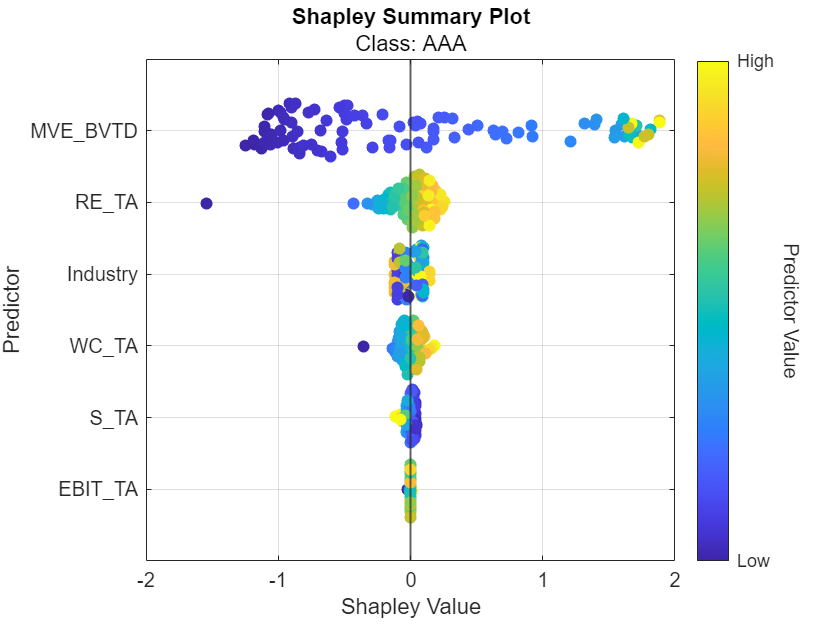
By default, the function shows the Shapley values for the first class, AAA. For each predictor, the function displays the Shapley values for the query points. The corresponding swarm chart shows the distribution of the Shapley values. The function determines the order of the predictors by using the mean absolute Shapley values.
For class AAA, the Shapley values for the RE_TA predictor seem to follow the trend of the predictor values. That is, query points with lower RE_TA values seem to have lower RE_TA Shapley values. Similarly, query points with higher RE_TA values seem to have higher RE_TA Shapley values. You can use data tips to see the query point predictor values.
Shapley Value Swarm Charts for Regression Model
Train a regression model and create a shapley object. Use the object function fit to compute the Shapley values for the specified query points. Then plot the Shapley values for multiple query points by using the swarmchart object function.
Load the carbig data set, which contains measurements of cars made in the 1970s and early 1980s.
load carbigCreate a table containing the predictor variables Acceleration, Cylinders, and so on, as well as the response variable MPG.
tbl = table(Acceleration,Cylinders,Displacement, ...
    Horsepower,Model_Year,Weight,MPG);
Removing missing values in a training set helps to reduce memory consumption and speed up training for the fitrkernel function. Remove missing values in tbl.
tbl = rmmissing(tbl);
Train a blackbox model of MPG by using the fitrkernel function. Specify the Cylinders and Model_Year variables as categorical predictors. Standardize the remaining predictors.
rng("default") % For reproducibility
mdl = fitrkernel(tbl,"MPG",CategoricalPredictors=[2 5], ...
    Standardize=true);
Create a shapley object. Because mdl does not contain training data, specify the data set tbl.
explainer = shapley(mdl,tbl)
explainer =
            BlackboxModel: [1×1 RegressionKernel]
              QueryPoints: []
           BlackboxFitted: []
                  Shapley: []
                        X: [392×7 table]
    CategoricalPredictors: [2 5]
                   Method: "interventional-kernel"
                Intercept: 23.2474
               NumSubsets: 64
explainer stores the training data tbl in the X property. By default, shapley subsamples 100 observations from the data in X and stores their indices in the SampledObservationIndices property.
Compute the Shapley values for all observations in tbl. To speed up computations, the fit object function uses the sampled observations rather than all of X to compute the Shapley values. Further reduce computational time by using the UseParallel name-value argument, if you have a Parallel Computing Toolbox™ license.
explainer = fit(explainer,tbl,UseParallel=true);
For a regression model, fit computes Shapley values using the predicted response, and stores them in the Shapley property of the shapley object. Because explainer contains Shapley values for multiple query points, display the mean absolute Shapley values instead.
explainer.MeanAbsoluteShapley
ans=6×2 table
      Predictor        Value
    ______________    _______

    "Acceleration"     0.5678
    "Cylinders"       0.96799
    "Displacement"    0.79668
    "Horsepower"      0.78681
    "Model_Year"      0.86258
    "Weight"            0.987
For each predictor, the mean absolute Shapley value is the absolute value of the Shapley values, averaged across all query points. The Cylinders predictor has the greatest mean absolute Shapley value, and the Acceleration predictor has the smallest mean absolute Shapley value.
Visualize the Shapley values by using the swarmchart object function. Specify to use the "copper" colormap.
swarmchart(explainer,ColorMap="copper")
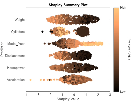
For each predictor, the function displays the Shapley values for the query points. The corresponding swarm chart shows the distribution of the Shapley values. The function determines the order of the predictors by using the mean absolute Shapley values.
Query points with low Weight values seem to have large positive Shapley values. That is, for these query points, the Weight predictor contributes to an increase in the MPG predicted value from the average. Similarly, query points with high Weight values seem to have large negative Shapley values. That is, for these query points, the Weight predictor contributes to a decrease in the MPG predicted value from the average. These results match the idea that car weights are inversely correlated with MPG values.
Input Arguments
explainer — Object explaining blackbox model
shapley object
Object explaining the blackbox model, specified as a shapley
object. explainer must contain Shapley values; that is,
explainer.Shapley must be nonempty.
ax — Axes for plot
Axes object
Axes for the plot, specified as an Axes object. If you do not specify ax, then swarmchart creates the plot using the current axes. For more information on creating an Axes object, see axes.
Name-Value Arguments
Specify optional pairs of arguments as
Name1=Value1,...,NameN=ValueN, where Name is
the argument name and Value is the corresponding value.
Name-value arguments must appear after other arguments, but the order of the
pairs does not matter.
Example: swarmchart(explainer,NumImportantPredictors=5,ColorMap="copper")
creates a swarm chart for each of the five predictors with the greatest mean absolute
Shapley values and uses the copper colormap to indicate the range of predictor
values.
NumImportantPredictors — Number of important predictors
min(M,10) where M is the number of predictors (default) | positive integer
Number of important predictors to plot, specified as a positive integer. The
swarmchart function plots the Shapley values of the specified
number of predictors with the greatest mean absolute Shapley values.
Example: NumImportantPredictors=5 specifies to plot the five most important predictors. The swarmchart function determines the order of importance by using the mean absolute Shapley values.
Data Types: single | double
ClassName — Class label to plot
explainer.BlackboxModel.ClassNames(1) (default) | numeric scalar | logical scalar | character vector | string scalar | categorical scalar
Class label to plot, specified as a numeric scalar, logical scalar, character vector, string
scalar, or categorical scalar. The value and data type of ClassName
must match one of the class names in the ClassNames property of the
machine learning model in explainer
(explainer.BlackboxModel.ClassNames). The software accepts
character vectors, string scalars, and categorical scalars interchangeably.
This argument is valid only when the machine learning model (BlackboxModel) in explainer is a classification model.
Example: ClassName="AAA"
Data Types: single | double | logical | char | string | categorical
YJitter — Type of jitter along y-dimension
"density" (default) | "rand"
Type of jitter (spacing of points) along the y-dimension, specified as one of the following values:
"density"— Jitter the points using the kernel density estimate of the Shapley values."rand"— Jitter the points randomly with a uniform distribution.
Example: YJitter="rand"
Data Types: char | string
ColorMap — Colormap for swarm charts
"default" (default) | "bluered" | colormap name | three-column matrix of RGB triplets
Colormap for the plot, specified as "default",
"bluered", a colormap name, or a three-column matrix of RGB triplets.
A value of
"default"sets the colormap to the default colormap for the target axesax, and a value of"bluered"sets the colormap to a color scale that ranges from blue to red.A colormap name specifies a predefined colormap, and a three-column matrix of RGB triplets specifies a custom colormap. For more information on the available colormaps and the creation of a matrix of RGP triplets, see
map.
For more information on how swarmchart maps predictor values
to the colormap, see Color Assignment for Predictor Values.
Example: ColorMap="parula"
Example: ColorMap="bluered"
Data Types: single | double | char | string
More About
Shapley Values
In game theory, the Shapley value of a player is the average marginal contribution of the player in a cooperative game. In the context of machine learning prediction, the Shapley value of a feature for a query point explains the contribution of the feature to a prediction (response for regression or score of each class for classification) at the specified query point.
The Shapley value of a feature for a query point is the contribution of the feature to the deviation from the average prediction. For a query point, the sum of the Shapley values for all features corresponds to the total deviation of the prediction from the average. That is, the sum of the average prediction and the Shapley values for all features corresponds to the prediction for the query point.
For more details, see Shapley Values for Machine Learning Model.
Tips
Use
swarmchartwhenexplainercontains Shapley values for many query points.
Algorithms
Color Assignment for Predictor Values
swarmchart maps predictor values to the colormap specified by the
ColorMap name-value argument as follows:
For each numeric predictor, the function determines the nonoutlier minimum and maximum values. The function maps the outliers and extrema (minimum and maximum values) to the appropriate colormap endpoints, and maps the remaining values to the interior of the colormap range using normalization.
For each nonnumeric predictor, the function uniformly maps categories to colors in the colormap. The color order of the categories is arbitrary.
Version History
Introduced in R2024a
MATLAB Command
You clicked a link that corresponds to this MATLAB command:
Run the command by entering it in the MATLAB Command Window. Web browsers do not support MATLAB commands.

Select a Web Site
Choose a web site to get translated content where available and see local events and offers. Based on your location, we recommend that you select: .
You can also select a web site from the following list
How to Get Best Site Performance
Select the China site (in Chinese or English) for best site performance. Other bat365 country sites are not optimized for visits from your location.
Americas
- América Latina (Español)
- Canada (English)
- United States (English)
Europe
- Belgium (English)
- Denmark (English)
- Deutschland (Deutsch)
- España (Español)
- Finland (English)
- France (Français)
- Ireland (English)
- Italia (Italiano)
- Luxembourg (English)
- Netherlands (English)
- Norway (English)
- Österreich (Deutsch)
- Portugal (English)
- Sweden (English)
- Switzerland
- United Kingdom (English)
Asia Pacific
- Australia (English)
- India (English)
- New Zealand (English)
- 中国
- 日本Japanese (日本語)
- 한국Korean (한국어)