Label
Label UI component
Description
A label UI component displays static text in an app. Use the
Label object to modify the appearance and behavior of a label after you
create it.
Creation
Create a label in an app using the uilabel function.
Properties
Text
Text — Label text
'Label' (default) | character vector | cell array of character vectors | string scalar | string array | ...
Label text, specified as a character vector, cell array of character vectors, string scalar, string array, or 1-D categorical array. Use a cell array of character vectors or a string array to specify multiple lines of text.
Alternatively, use the sprintf function
to create formatted text containing line breaks and other special
characters.
text = sprintf('%s\n%s','Line 1','Line 2');
label = uilabel('Text',text,'Position',[100 100 100 32]);
![]()
If you specify text as a character vector without using sprintf,
MATLAB® will not interpret control sequences such as \n.
If you specify this property as a categorical array, MATLAB uses the values in the array, not the full set of categories.
Example: 'Threshold'
Example: {'Threshold' 'Value'}
Interpreter — Label text interpreter
'none' (default) | 'tex' | 'latex' | 'html'
Label text interpreter, specified as:
'none'— Display literal characters.'tex'— Interpret text using a subset of TeX markup.'latex'— Interpret text using a subset of LaTeX markup.'html'— Interpret text using a subset of HTML markup.
TeX Markup
Use TeX markup to add superscripts and subscripts and to include special characters in the text.
Modifiers remain in effect until the end of the text.
Superscripts and subscripts are an exception because they modify only the next character or the
characters within the curly braces. When you set the interpreter to 'tex',
the supported modifiers are as follows.
| Modifier | Description | Example |
|---|---|---|
^{ } | Superscript | 'text^{superscript}' |
_{ } | Subscript | 'text_{subscript}' |
\bf | Bold font | '\bf text' |
\it | Italic font | '\it text' |
\sl | Oblique font (usually the same as italic font) | '\sl text' |
\rm | Normal font | '\rm text' |
\fontname{ | Font name — Replace
| '\fontname{Courier} text' |
\fontsize{ | Font size —Replace
| '\fontsize{15} text' |
\color{ | Font color — Replace
red, green,
yellow, magenta,
blue, black,
white, gray,
darkGreen, orange, or
lightBlue. | '\color{magenta} text' |
\color[rgb]{specifier} | Custom font color — Replace
| '\color[rgb]{0,0.5,0.5} text' |
This table lists the supported special characters for the
'tex' interpreter.
| Character Sequence | Symbol | Character Sequence | Symbol | Character Sequence | Symbol |
|---|---|---|---|---|---|
| α |
| υ |
| ~ |
| ∠ |
| ϕ |
| ≤ |
|
|
| χ |
| ∞ |
| β |
| ψ |
| ♣ |
| γ |
| ω |
| ♦ |
| δ |
| Γ |
| ♥ |
| ϵ |
| Δ |
| ♠ |
| ζ |
| Θ |
| ↔ |
| η |
| Λ |
| ← |
| θ |
| Ξ |
| ⇐ |
| ϑ |
| Π |
| ↑ |
| ι |
| Σ |
| → |
| κ |
| ϒ |
| ⇒ |
| λ |
| Φ |
| ↓ |
| µ |
| Ψ |
| º |
| ν |
| Ω |
| ± |
| ξ |
| ∀ |
| ≥ |
| π |
| ∃ |
| ∝ |
| ρ |
| ∍ |
| ∂ |
| σ |
| ≅ |
| • |
| ς |
| ≈ |
| ÷ |
| τ |
| ℜ |
| ≠ |
| ≡ |
| ⊕ |
| ℵ |
| ℑ |
| ∪ |
| ℘ |
| ⊗ |
| ⊆ |
| ∅ |
| ∩ |
| ∈ |
| ⊇ |
| ⊃ |
| ⌈ |
| ⊂ |
| ∫ |
| · |
| ο |
| ⌋ |
| ¬ |
| ∇ |
| ⌊ |
| x |
| ... |
| ⊥ |
| √ |
| ´ |
| ∧ |
| ϖ |
| ∅ |
| ⌉ |
| 〉 |
| | |
| ∨ |
| 〈 |
| © |
LaTeX Markup
To use LaTeX markup, set the interpreter to 'latex'. Use
LaTeX markup to format and display mathematical expressions, equations, and special
characters. Use dollar symbols around the marked up text. For example, use
'$\int_1^{20} x^2 dx$' for inline mode or
'$$\int_1^{20} x^2 dx$$' for display mode.
The displayed text uses the default LaTeX font style. The
FontName, FontWeight, and
FontAngle label properties do not have an effect. To change
the font style, use LaTeX markup.
MATLAB supports most standard LaTeX math mode commands. For more information, see Supported LaTeX Commands.
HTML Markup
To use HTML markup, set the interpreter to 'html'. Setting
font styles via HTML overrides any equivalent Label font
properties. For example, the following code results in red text.
lbl = uilabel('Interpreter','html');
lbl.Text = '<p style="color: red;">Text</p>';
lbl.FontColor = 'blue';
The interpreter supports a subset of HTML markup. As a general guideline, the interpreter supports text-related tags and styles. Unsupported tags and styles are ignored.
This table lists the supported elements and element attributes.
| HTML Element | Attributes | Description |
|---|---|---|
a | style, target, href, title | Hyperlink |
abbr | style, title | Abbreviation or acronym |
address | style | Contact information |
article | style | Self-contained, independent content |
aside | style | Content indirectly related to the main content |
b | style | Bold text |
bdi | style, dir | Content formatted in a different direction from surrounding text |
bdo | style, dir | Content formatted in a different direction from surrounding text |
big | style | Text one font size level larger than surrounding text (obsolete in HTML5) |
blockquote | style, cite | Extended quotation |
br | n/a | Line break |
caption | style | Caption or title of a table |
center | style | Content centered horizontally |
cite | style | Title of a creative work |
code | style | Fragment of code |
col | style, align, valign, span, width | Column within a table |
colgroup | style, align, valign, span, width | Group of columns within a table |
dd | style | Term or value in a description list |
del | style, datetime | Text that was deleted from a document |
details | style, open | Interactive widget with text visible only when toggled to 'open' state |
dl | style | Description list |
dt | style | Term or value in a description list |
em | style | Emphasized text (typically displayed in italic) |
font | style, color, size, face | Text with specified font properties (obsolete in HTML5) |
footer | style | Footer |
h1. h2, h3, h4, h5, h6 | style | Section heading — <h1> is the highest level of heading and <h6> is the lowest |
header | style | Introductory content |
hr | style | Thematic break |
i | style | Text offset from the surrounding content — by default rendered as italic |
ins | style, datetime | Text inserted into a document |
li | style | Item in a list |
mark | style | Marked or highlighted text |
ol | style | Ordered list |
p | style | Paragraph |
pre | style | Preformatted text |
s | style | Text with a strikethrough |
strike | style | Text with a strikethrough (obsolete in HTML5) |
section | style | Standalone section |
small | style | Text one font size level smaller than surrounding text (obsolete in HTML5) |
sub | style | Subscript |
sup | style | Superscript |
strong | style | Text with strong importance |
table | style, width, border, align, valign | Table |
tbody | style, align, valign | Table body |
td | style, width, rowspan, colspan, align, valign | Table data cell |
tfoot | style, align, valign | Set of table rows that summarize the table columns |
th | style, width, rowspan, colspan, align, valign | Table data cell specified as a header of a group of cells |
thead | style, align, valign | Set of table rows that specify the column heads |
tr | style, rowspan, align, valign | Row of table cells |
tt | style | Monospace text (obsolete in HTML5) |
u | style | Text with an unarticulated annotation — by default rendered as an underline |
ul | style | Unordered list |
For more information about these elements, see https://developer.mozilla.org/en-US/docs/Web/HTML/Element.
To use HTML markup to create a hyperlink that runs MATLAB code, see Create Hyperlinks that Run Functions.
You can use HTML style attributes to format HTML content. A style attribute is a string of CSS attributes and their values.
These CSS attributes are supported:
background-colorborder-bottomborder-bottom-colorborder-bottom-left-radiusborder-bottom-right-radiusborder-bottom-styleborder-bottom-widthborder-leftborder-left-colorborder-left-styleborder-left-widthborder-radiusborder-rightborder-right-colorborder-right-styleborder-right-widthborder-spacingborder-styleborder-topborder-top-colorborder-top-left-radiusborder-top-right-radiusborder-top-styleborder-top-widthborder-widthcolordirectionfont-familyfont-sizefont-stylefont-weightheighthiddenline-heightmarginmargin-bottommargin-leftmargin-rightmargin-topmax-heightmax-widthmin-heightmin-widthoverflowoverflow-wrapoverflow-xoverflow-ypaddingpadding-bottompadding-leftpadding-rightpadding-toptext-aligntext-anchortext-decorationtext-indenttext-overflowtext-shadowtext-transformtitletranslatewhite-spacewidth
For more information about these attributes, see https://developer.mozilla.org/en-US/docs/Web/CSS/Reference.
HorizontalAlignment — Horizontal alignment of text
'left' (default) | 'right' | 'center'
Horizontal alignment of the text, specified as:
'right'— Text aligns on the right side of the area specified by thePositionproperty.'left'— Text aligns on the left side of the area specified by thePositionproperty.'center'— Text centers horizontally in the area specified by thePositionproperty.
Aligning label text is useful when the text spans multiple lines.
VerticalAlignment — Vertical alignment of text
'center' (default) | 'top' | 'bottom'
Vertical alignment of the text, specified as one of the following:
'center'— Text centers vertically in the area specified by thePositionproperty.'top'— Text aligns on the top of the area specified by thePositionproperty.'bottom'— Text aligns on the bottom of the area specified by thePositionproperty.
Aligning label text is useful when the text spans multiple lines.
WordWrap — Word wrapping to fit component width
'off' (default) | on/off logical value
Word wrapping to fit component width, specified as 'off' or 'on', or as numeric or logical 0 (false) or 1 (true). A value of 'off' is equivalent to false, and 'on' is equivalent to true. Thus, you can use the value of this property as a logical value. The value is stored as an on/off logical value of type matlab.lang.OnOffSwitchState.
Use this property to prevent text from getting clipped horizontally when the width of the component is smaller than the text you want to display.
'off'— Text does not wrap.'on'— Breaks text into new lines so that each line fits within the width of the component and avoids breaking words when possible.
Setting the WordWrap property to 'on' does not
prevent text from getting clipped vertically when the height of the component is too
small to display all the lines of text.
Font and Color
FontName — Font name
system supported font name
Font name, specified as a system supported font name. The default font depends on the specific operating system and locale.
If the specified font is not available, then MATLAB uses the best match among the fonts available on the system where the app is running.
Example: 'Arial'
FontSize — Font size
positive number
Font size, specified as a positive number. The units of measurement are pixels. The default font size depends on the specific operating system and locale.
Example: 14
FontWeight — Font weight
'normal' (default) | 'bold'
Font weight, specified as one of these values:
'normal'— Default weight as defined by the particular font'bold'— Thicker character outlines than'normal'
Not all fonts have a bold font weight. For fonts that do not, specifying
'bold' results in the normal font weight.
FontAngle — Font angle
'normal' (default) | 'italic'
Font angle, specified as 'normal' or 'italic'.
Not all fonts have an italic font angle. For fonts that do not, specifying
'italic' results in the normal font angle.
FontColor — Font color
[0 0 0] (default) | RGB triplet | hexadecimal color code | 'r' | 'g' | 'b' | ...
Font color, specified as an RGB triplet, a hexadecimal color code, or one of the options listed in the table.
RGB triplets and hexadecimal color codes are useful for specifying custom colors.
An RGB triplet is a three-element row vector whose elements specify the intensities of the red, green, and blue components of the color. The intensities must be in the range
[0,1]; for example,[0.4 0.6 0.7].A hexadecimal color code is a character vector or a string scalar that starts with a hash symbol (
#) followed by three or six hexadecimal digits, which can range from0toF. The values are not case sensitive. Thus, the color codes"#FF8800","#ff8800","#F80", and"#f80"are equivalent.
Alternatively, you can specify some common colors by name. This table lists the named color options, the equivalent RGB triplets, and hexadecimal color codes.
| Color Name | Short Name | RGB Triplet | Hexadecimal Color Code | Appearance |
|---|---|---|---|---|
"red" | "r" | [1 0 0] | "#FF0000" |
|
"green" | "g" | [0 1 0] | "#00FF00" |
|
"blue" | "b" | [0 0 1] | "#0000FF" |
|
"cyan"
| "c" | [0 1 1] | "#00FFFF" |
|
"magenta" | "m" | [1 0 1] | "#FF00FF" |
|
"yellow" | "y" | [1 1 0] | "#FFFF00" |
|
"black" | "k" | [0 0 0] | "#000000" |
|
"white" | "w" | [1 1 1] | "#FFFFFF" |
|
Here are the RGB triplets and hexadecimal color codes for the default colors MATLAB uses in many types of plots.
| RGB Triplet | Hexadecimal Color Code | Appearance |
|---|---|---|
[0 0.4470 0.7410] | "#0072BD" |
|
[0.8500 0.3250 0.0980] | "#D95319" |
|
[0.9290 0.6940 0.1250] | "#EDB120" |
|
[0.4940 0.1840 0.5560] | "#7E2F8E" |
|
[0.4660 0.6740 0.1880] | "#77AC30" |
|
[0.3010 0.7450 0.9330] | "#4DBEEE" |
|
[0.6350 0.0780 0.1840] | "#A2142F" |
|
BackgroundColor — Background color
'none' (default) | RGB triplet | hexadecimal color code | 'r' | 'g' | 'b' | ...
Background color, specified as an RGB triplet, a hexadecimal color code, or one of the color options listed in the table.
For a custom color, specify an RGB triplet or a hexadecimal color code.
An RGB triplet is a three-element row vector whose elements specify the intensities of the red, green, and blue components of the color. The intensities must be in the range
[0,1], for example,[0.4 0.6 0.7].A hexadecimal color code is a string scalar or character vector that starts with a hash symbol (
#) followed by three or six hexadecimal digits, which can range from0toF. The values are not case sensitive. Therefore, the color codes"#FF8800","#ff8800","#F80", and"#f80"are equivalent.
Alternatively, you can specify some common colors by name. This table lists the named color options, the equivalent RGB triplets, and hexadecimal color codes.
| Color Name | Short Name | RGB Triplet | Hexadecimal Color Code | Appearance |
|---|---|---|---|---|
"red" | "r" | [1 0 0] | "#FF0000" |
|
"green" | "g" | [0 1 0] | "#00FF00" |
|
"blue" | "b" | [0 0 1] | "#0000FF" |
|
"cyan"
| "c" | [0 1 1] | "#00FFFF" |
|
"magenta" | "m" | [1 0 1] | "#FF00FF" |
|
"yellow" | "y" | [1 1 0] | "#FFFF00" |
|
"black" | "k" | [0 0 0] | "#000000" |
|
"white" | "w" | [1 1 1] | "#FFFFFF" |
|
"none" | Not applicable | Not applicable | Not applicable | No color |
Here are the RGB triplets and hexadecimal color codes for the default colors MATLAB uses in many types of plots.
| RGB Triplet | Hexadecimal Color Code | Appearance |
|---|---|---|
[0 0.4470 0.7410] | "#0072BD" |
|
[0.8500 0.3250 0.0980] | "#D95319" |
|
[0.9290 0.6940 0.1250] | "#EDB120" |
|
[0.4940 0.1840 0.5560] | "#7E2F8E" |
|
[0.4660 0.6740 0.1880] | "#77AC30" |
|
[0.3010 0.7450 0.9330] | "#4DBEEE" |
|
[0.6350 0.0780 0.1840] | "#A2142F" |
|
Data Types: double | char
Interactivity
Visible — State of visibility
'on' (default) | on/off logical value
State of visibility, specified as 'on' or 'off',
or as numeric or logical 1 (true) or
0 (false). A value of 'on'
is equivalent to true, and 'off' is equivalent to
false. Thus, you can use the value of this property as a logical
value. The value is stored as an on/off logical value of type matlab.lang.OnOffSwitchState.
'on'— Display the object.'off'— Hide the object without deleting it. You still can access the properties of an invisible UI component.
To make your app start faster, set the Visible property to
'off' for all UI components that do not need to appear at
startup.
Enable — Visual appearance of label
'on' (default) | on/off logical value
Visual appearance of the label, specified as 'on' or
'off', or as numeric or logical 1
(true) or 0 (false). A
value of 'on' is equivalent to true, and
'off' is equivalent to false. Thus, you can
use the value of this property as a logical value. The value is stored as an on/off
logical value of type matlab.lang.OnOffSwitchState.
'on'— Label appears normal
'off'— Label appears dimmed
Tooltip — Tooltip
'' (default) | character vector | cell array of character vectors | string array | 1-D categorical array
Tooltip, specified as a character vector, cell array of character vectors, string array, or 1-D categorical array. Use this property to display a message when the user hovers the pointer over the component at run time. The tooltip displays even when the component is disabled. To display multiple lines of text, specify a cell array of character vectors or a string array. Each element in the array becomes a separate line of text. If you specify this property as a categorical array, MATLAB uses the values in the array, not the full set of categories.
ContextMenu — Context menu
empty GraphicsPlaceholder array (default) | ContextMenu object
Context menu, specified as a ContextMenu object created using the uicontextmenu function. Use this property to display a context menu when
you right-click on a component.
Position
Position — Label location and size
[100 100 31 22] (default) | [left bottom width height]
Label location and size, relative to the parent, specified as the vector [left bottom
width height]. This table describes each element in the
vector.
| Element | Description |
|---|---|
left | Distance from the inner left edge of the parent container to the outer left edge of the label |
bottom | Distance from the inner bottom edge of the parent container to the outer bottom edge of the label |
width | Distance between the right and left outer edges of the label |
height | Distance between the top and bottom outer edges of the label |
The Position values are relative to the
drawable area of the parent container. The drawable area is the area
inside the borders of the container and does not include the area occupied by decorations such
as a menu bar or title.
All measurements are in pixel units.
Example: [100 100 100 20]
InnerPosition — Inner location and size of label
[100 100 31 22] (default) | [left bottom width height]
Inner location and size of label, specified as [left bottom width
height]. Position values are relative to the parent container. All
measurements are in pixel units. This property value is identical to
Position property.
OuterPosition — Outer location and size of label
[100 100 31 22] (default) | [left bottom width height]
This property is read-only.
Outer location and size of label, returned as [left bottom width
height]. Position values are relative to the parent container. All
measurements are in pixel units. This property value is identical to
Position.
Layout — Layout options
empty LayoutOptions array (default) | GridLayoutOptions object
Layout options, specified as a
GridLayoutOptions object. This property specifies options for
components that are children of grid layout containers. If the component is not a
child of a grid layout container (for example, it is a child of a figure or panel),
then this property is empty and has no effect. However, if the component is a child of
a grid layout container, you can place the component in the desired row and column of
the grid by setting the Row and Column
properties on the GridLayoutOptions object.
For example, this code places a label in the third row and second column of its parent grid.
g = uigridlayout([4 3]);
tlabel = uilabel(g);
tlabel.Layout.Row = 3;
tlabel.Layout.Column = 2;
To make the label span multiple rows or columns, specify the
Row or Column property as a two-element
vector. For example, this label spans columns 2 through
3:
tlabel.Layout.Column = [2 3];
Callbacks
CreateFcn — Creation function
'' (default) | function handle | cell array | character vector
Object creation function, specified as one of these values:
Function handle.
Cell array in which the first element is a function handle. Subsequent elements in the cell array are the arguments to pass to the callback function.
Character vector containing a valid MATLAB expression (not recommended). MATLAB evaluates this expression in the base workspace.
For more information about specifying a callback as a function handle, cell array, or character vector, see Callbacks in App Designer.
This property specifies a callback function to execute when MATLAB creates the object. MATLAB initializes all property values before executing the CreateFcn callback. If you do not specify the CreateFcn property, then MATLAB executes a default creation function.
Setting the CreateFcn property on an existing component has no effect.
If you specify this property as a function handle or cell array, you can access the object that is being created using the first argument of the callback function. Otherwise, use the gcbo function to access the object.
DeleteFcn — Deletion function
'' (default) | function handle | cell array | character vector
Object deletion function, specified as one of these values:
Function handle.
Cell array in which the first element is a function handle. Subsequent elements in the cell array are the arguments to pass to the callback function.
Character vector containing a valid MATLAB expression (not recommended). MATLAB evaluates this expression in the base workspace.
For more information about specifying a callback as a function handle, cell array, or character vector, see Callbacks in App Designer.
This property specifies a callback function to execute when MATLAB deletes the object. MATLAB executes the DeleteFcn callback before destroying the
properties of the object. If you do not specify the DeleteFcn
property, then MATLAB executes a default deletion function.
If you specify this property as a function handle or cell array, you can access the
object that is being deleted using the first argument of the callback function.
Otherwise, use the gcbo function to access the
object.
Callback Execution Control
Interruptible — Callback interruption
'on' (default) | on/off logical value
Callback interruption, specified as 'on' or 'off', or as
numeric or logical 1 (true) or
0 (false). A value of 'on'
is equivalent to true, and 'off' is equivalent to
false. Thus, you can use the value of this property as a logical
value. The value is stored as an on/off logical value of type matlab.lang.OnOffSwitchState.
This property determines if a running callback can be interrupted. There are two callback states to consider:
The running callback is the currently executing callback.
The interrupting callback is a callback that tries to interrupt the running callback.
MATLAB determines callback interruption behavior whenever it executes a command that
processes the callback queue. These commands include drawnow, figure, uifigure, getframe, waitfor, and pause.
If the running callback does not contain one of these commands, then no interruption occurs. MATLAB first finishes executing the running callback, and later executes the interrupting callback.
If the running callback does contain one of these commands, then the
Interruptible property of the object that owns the running
callback determines if the interruption occurs:
If the value of
Interruptibleis'off', then no interruption occurs. Instead, theBusyActionproperty of the object that owns the interrupting callback determines if the interrupting callback is discarded or added to the callback queue.If the value of
Interruptibleis'on', then the interruption occurs. The next time MATLAB processes the callback queue, it stops the execution of the running callback and executes the interrupting callback. After the interrupting callback completes, MATLAB then resumes executing the running callback.
Note
Callback interruption and execution behave differently in these situations:
If the interrupting callback is a
DeleteFcn,CloseRequestFcn, orSizeChangedFcncallback, then the interruption occurs regardless of theInterruptibleproperty value.If the running callback is currently executing the
waitforfunction, then the interruption occurs regardless of theInterruptibleproperty value.If the interrupting callback is owned by a
Timerobject, then the callback executes according to schedule regardless of theInterruptibleproperty value.
BusyAction — Callback queuing
'queue' (default) | 'cancel'
Callback queuing, specified as 'queue' or 'cancel'. The BusyAction property determines how MATLAB handles the execution of interrupting callbacks. There are two callback states to consider:
The running callback is the currently executing callback.
The interrupting callback is a callback that tries to interrupt the running callback.
The BusyAction property determines callback queuing behavior only
when both of these conditions are met:
Under these conditions, the BusyAction property of the
object that owns the interrupting callback determines how MATLAB handles the interrupting callback. These are possible values of the
BusyAction property:
'queue'— Puts the interrupting callback in a queue to be processed after the running callback finishes execution.'cancel'— Does not execute the interrupting callback.
BeingDeleted — Deletion status
on/off logical value
This property is read-only.
Deletion status, returned as an on/off logical value of type matlab.lang.OnOffSwitchState.
MATLAB sets the BeingDeleted property to
'on' when the DeleteFcn callback begins
execution. The BeingDeleted property remains set to
'on' until the component object no longer exists.
Check the value of the BeingDeleted property to verify that the object is not about to be deleted before querying or modifying it.
Parent/Child
Parent — Parent container
Figure object (default) | Panel object | Tab object | ButtonGroup object | GridLayout object
Parent container, specified as a Figure object
created using the uifigure function, or one of its child
containers: Tab, Panel, ButtonGroup, or GridLayout. If no container is specified, MATLAB calls the uifigure function to create a new Figure object that serves as the parent container.
HandleVisibility — Visibility of object handle
'on' (default) | 'callback' | 'off'
Visibility of the object handle, specified as 'on', 'callback',
or 'off'.
This property controls the visibility of the object in its parent's
list of children. When an object is not visible in its parent's list
of children, it is not returned by functions that obtain objects by
searching the object hierarchy or querying properties. These functions
include get, findobj, clf,
and close. Objects are valid
even if they are not visible. If you can access an object, you can
set and get its properties, and pass it to any function that operates
on objects.
| HandleVisibility Value | Description |
|---|---|
'on' | The object is always visible. |
'callback' | The object is visible from within callbacks or functions invoked by callbacks, but not from within functions invoked from the command line. This option blocks access to the object at the command-line, but allows callback functions to access it. |
'off' | The object is invisible at all times. This option is useful
for preventing unintended changes to the UI by another function. Set
the HandleVisibility to 'off' to
temporarily hide the object during the execution of that function.
|
Identifiers
Type — Type of graphics object
'uilabel'
This property is read-only.
Type of graphics object, returned as 'uilabel'.
Tag — Object identifier
'' (default) | character vector | string scalar
Object identifier, specified as a character vector or string scalar. You can specify a unique Tag value to serve as an identifier for an object. When you need access to the object elsewhere in your code, you can use the findobj function to search for the object based on the Tag value.
UserData — User data
[] (default) | array
User data, specified as any MATLAB array. For example, you can specify a scalar, vector, matrix, cell array, character array, table, or structure. Use this property to store arbitrary data on an object.
If you are working in App Designer, create public or private properties in the app to share data instead of using the UserData property. For more information, see Share Data Within App Designer Apps.
Examples
Set and Access Label Component Properties
Create a default label.
fig = uifigure;
lbl = uilabel(fig);
Change the label text and font size.
lbl.Text = "Result";
lbl.FontSize = 14;
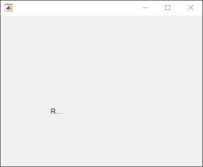
The label is clipped because the current label size is too small for the new text at the new font size.
Determine the current label size by getting the third and fourth elements of the
Position property value.
size = lbl.Position(3:4)
size =

    31    15
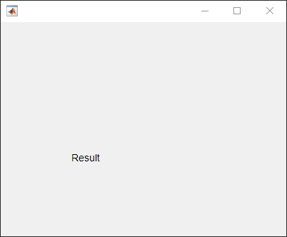
Change the label size to accommodate the new text.
lbl.Position(3:4) = [62 22];
Wrap Long Label Text
Wrap label text to fit within the width of a label.
Create a label. Specify the label text and size.
fig = uifigure;
lbl = uilabel(fig);
lbl.Text = "The data shown represents 18 months of observations.";
lbl.Position = [100 100 100 60];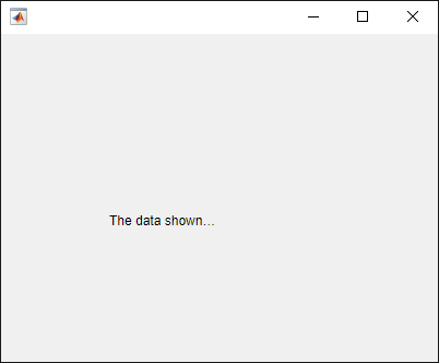
Wrap the text in the label.
lbl.WordWrap = "on";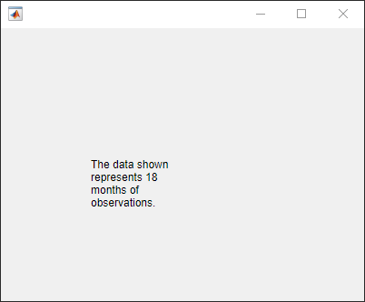
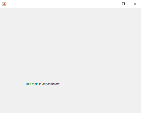
Format Label Text
Use HTML markup to selectively format parts of the label text.
Create a label and specify the label size.
fig = uifigure;
lbl = uilabel(fig,"Position",[100 100 150 32]);
Specify the label text using HTML markup and set the label to interpret the text as HTML.
lbl.Text = "<font style='color:green;'>This table</font> is <em>not complete</em>."
lbl.Interpreter = "html";
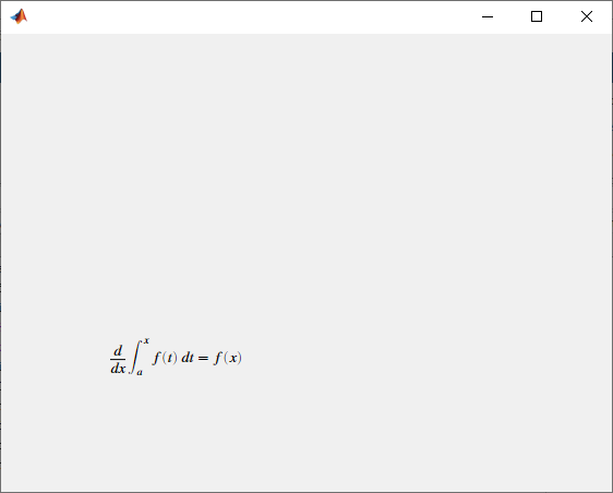
Display Equation
Use LaTeX to display a formatted equation.
Create a label and specify the label size.
fig = uifigure;
lbl = uilabel(fig,"Position",[100 100 125 50]);
Specify the label text and set the label to interpret the text as LaTeX.
lbl.Text = "$$\frac{d}{dx} \int_a^x f(t)\;dt = f(x)$$"
lbl.Interpreter = "latex";
Version History
Introduced in R2016aR2021a: Style text and display equations
Use the Interpreter property to enable HTML or LaTeX markup for the
label text.
R2020b: Wrap label text
Use the WordWrap property to prevent text from getting clipped
horizontally when the width of the UI component is smaller than the text you want to
display. Setting the WordWrap property to 'on'
breaks the text into new lines so that each line fits within the component. It avoids
breaking words when possible. When the property is set to 'off', the
text does not wrap.
MATLAB Command
You clicked a link that corresponds to this MATLAB command:
Run the command by entering it in the MATLAB Command Window. Web browsers do not support MATLAB commands.

Select a Web Site
Choose a web site to get translated content where available and see local events and offers. Based on your location, we recommend that you select: .
You can also select a web site from the following list
How to Get Best Site Performance
Select the China site (in Chinese or English) for best site performance. Other bat365 country sites are not optimized for visits from your location.
Americas
- América Latina (Español)
- Canada (English)
- United States (English)
Europe
- Belgium (English)
- Denmark (English)
- Deutschland (Deutsch)
- España (Español)
- Finland (English)
- France (Français)
- Ireland (English)
- Italia (Italiano)
- Luxembourg (English)
- Netherlands (English)
- Norway (English)
- Österreich (Deutsch)
- Portugal (English)
- Sweden (English)
- Switzerland
- United Kingdom (English)
Asia Pacific
- Australia (English)
- India (English)
- New Zealand (English)
- 中国
- 日本Japanese (日本語)
- 한국Korean (한국어)